

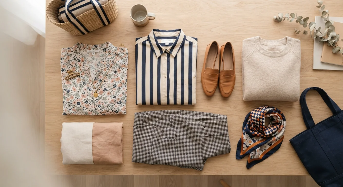
Key Takeaways
- Varying the scale of patterns is the single most reliable way to prevent visual clutter.
- Sharing at least one colour between patterns creates cohesion without matching too literally.
- Geometric and organic prints pair more naturally than two competing prints of the same type.
- Solid colours act as visual anchors, giving the eye a place to rest in a mixed-print outfit.
- Context matters — some settings call for restraint even when a combination is technically sound.
What you will need
Why Mixing Patterns Feels Risky — And Why It Doesn't Have to Be
The hesitation around mixing patterns usually comes from a lack of a clear framework. Without one, combining a striped shirt with a floral skirt can feel arbitrary — a gamble rather than a choice. But pattern mixing follows a logic, and once you understand the underlying principles, it becomes one of the most expressive tools in everyday dressing.
Pattern combinations go wrong in predictable ways: competing scales, clashing colour temperatures, or two prints of the same visual weight fighting for dominance. Understanding what makes combinations fail is actually the fastest route to knowing what makes them work. See our guide to which style rules hold up for broader context on where conventional fashion advice is worth trusting.
Start With Two Patterns, Not Three
When building confidence with pattern mixing, limit yourself to two prints per outfit at first. Once you have a reliable instinct for what works, you can experiment with a third — but two well-chosen patterns almost always outperform three competing ones.
What You Need Before You Start
Before attempting a mixed-print outfit, it helps to lay everything out together in good light — preferably daylight. Your eye will read combinations differently on a hanger versus on your body, and laying pieces flat first lets you assess scale and colour without committing. A basic grasp of colour relationships also helps; if you're uncertain about warm, cool, and neutral tones, our colour coordination primer is a practical starting point.
What you will need
How to Mix Patterns Confidently: Step by Step
Follow these steps each time you're building an outfit around more than one print. With practice, the process becomes intuitive.
Anchor with a dominant pattern
Choose one print to lead the outfit. This is usually the largest piece — a dress, trousers, or a statement jacket. Everything else builds around it. Trying to give two prints equal prominence is the most common reason combinations feel chaotic.
Vary the scale deliberately
Pair a large-scale print with a noticeably smaller one. A wide bold stripe reads very differently from a narrow pinstripe; a large painterly floral sits differently next to a tiny ditsy print. The contrast in scale is what separates a considered combination from a busy one.
Find at least one shared colour
Your two (or more) prints don't need to match, but they should share at least one colour — even a near-neutral like cream, tan, or navy. That shared thread is what the eye uses to read the combination as intentional rather than accidental.
Mix pattern types, not just colours
Geometric and organic prints tend to complement each other more naturally than two prints from the same family. Stripes and florals, checks and abstract prints, plaids and polka dots — these pairings work because each pattern has a distinct visual language. Two large florals or two wide stripes, by contrast, can feel repetitive or combative.
Introduce a solid to anchor the look
When mixing two or more patterns, a solid-colour piece — a blazer, belt, shoe, or bag — gives the eye a neutral resting point. It doesn't neutralise the combination; it frames it. Accessories in a single solid colour also help, particularly when patterns are doing significant work elsewhere in the outfit. For more on keeping accessories in proportion, see our piece on accessorising with restraint.
When Mixing Works — and When to Pull Back
Pattern mixing tends to succeed when the outfit reads as intentional: the viewer senses a guiding logic, even if they can't articulate it. It typically falters when two prints compete equally for attention — same scale, similar colour saturation, similar visual weight — leaving no hierarchy for the eye to follow.
Context is also a real variable. A maximalist mixed-print look that feels energetic and considered at a weekend market may read as distracting in a formal meeting. This isn't about suppressing personal style; it's about understanding your audience. Our article on balancing occasion and personal expression explores how to navigate that tension without abandoning what you enjoy wearing.
Finally, proportion plays a role that's easy to overlook. A boldly patterned wide-leg trouser paired with a printed blouse creates very different visual results than the same prints worn in slim-cut silhouettes. Understanding how proportion and silhouette shape an outfit's overall read will sharpen your instincts here.
More Patterns Isn't Always More Interesting
Adding a third or fourth print without a strong visual rationale rarely improves an outfit. If you're layering multiple patterns and something feels off, the solution is usually to remove one — not to add a fourth. Restraint is a form of confidence, not timidity.