

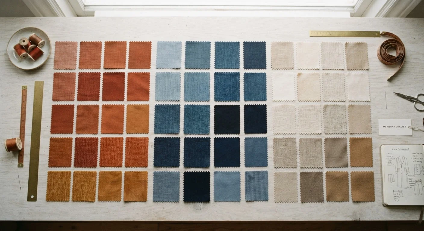
Key Takeaways
- Warm tones include reds, oranges, yellows, and earthy shades like terracotta and camel.
- Cool tones include blues, greens, purples, and icy shades like lavender and slate.
- Neutral tones — beige, grey, white, navy — anchor outfits and bridge warm and cool pieces.
- Pairing colours within the same temperature family creates cohesion without effort.
- Mixing warm and cool tones intentionally can create striking contrast when done deliberately.
- Identifying your skin's undertone can guide which colour families tend to complement you most.
Colour Temperature in Fashion
Colour temperature describes whether a hue leans warm (yellow, orange, or red undertones), cool (blue, green, or purple undertones), or neutral (a balance of both). In fashion, understanding colour temperature helps you combine clothes and accessories in ways that feel intentional and visually harmonious. It's the underlying logic behind why some outfits look effortlessly pulled-together while others feel slightly off.
On the traditional colour wheel, warm colours occupy the red-yellow arc and cool colours occupy the blue-violet arc. Neutral colours — including many beiges, greys, and whites — sit outside this warm/cool spectrum or contain balanced undertones of both.
Why Colour Temperature Matters in Getting Dressed
Most people sense when an outfit works but struggle to explain why. Often, the answer lies in colour temperature — the invisible logic that makes some colour combinations feel natural and others feel jarring. Once you understand the basic framework of warm, cool, and neutral tones, getting dressed becomes far less guesswork.
This isn't about strict rules. It's about pattern recognition. When you know that olive and camel share warm undertones, or that slate blue and lavender belong to the same cool family, you can mix them confidently. Equally, you learn where contrast can work in your favour. Building a wardrobe from scratch becomes far simpler once colour temperature shapes which pieces you choose to invest in.
90 sec
Average time spent choosing an outfit daily
Research on consumer decision-making suggests most people spend under two minutes selecting what to wear, making a reliable colour framework especially valuable.
3
Colour families covering all fashion hues
Every colour used in fashion can be classified as warm, cool, or neutral — making this a universally applicable framework for outfit building.
Breaking Down the Three Colour Families
Warm Tones
Warm colours carry undertones of red, orange, or yellow. In a wardrobe context, this family includes rust, terracotta, mustard, camel, olive, burnt orange, coral, and warm red. Earth tones almost always fall here. These shades tend to feel grounded, energetic, and tactile — they're particularly effective in autumn and winter dressing but work year-round.
Cool Tones
Cool colours are anchored by blue, green, or violet undertones. Think cobalt, slate, sage, lavender, dusty rose with a grey cast, and forest green. These shades feel calm, precise, and clean. Cool palettes often photograph crisply and tend to read as polished in professional settings.
Neutral Tones
Neutrals — white, black, navy, grey, beige, cream, and camel — function as the connective tissue of any outfit. They don't assert a strong temperature of their own, which makes them reliable bridges. A warm-toned blouse paired with a cool-toned skirt can feel cohesive when a neutral layer or accessory sits between them. Choosing accessories thoughtfully within your colour temperature can reinforce an outfit's overall harmony.
Start With Your Neutrals
If you're unsure where to begin, anchor your outfit in a neutral — white, grey, navy, or beige — and then layer in one warm or one cool colour. This limits the number of temperature decisions you need to make and almost always produces a balanced result. Once this feels instinctive, adding a second colour becomes much easier.
Putting the Framework Into Practice
The most practical approach to colour coordination is to treat one colour temperature as the base of your outfit and build from there. If your trousers are a cool grey and your shirt is a cool white, you have a cohesive foundation. Adding a warm caramel belt introduces controlled contrast without breaking the logic of the look.
Patterns and prints follow the same principle. A floral print that combines coral and olive reads as warm overall; pairing it with cool lavender creates deliberate tension. Understanding how prints interact is easier once you can identify the dominant colour temperature within the pattern itself.
Colour temperature also interacts with proportion and structure. A head-to-toe warm palette in relaxed silhouettes reads very differently from the same palette in tailored pieces. Proportion and silhouette shape how colour reads at a distance, so it's worth considering both dimensions together.
Colour Temperature Across Seasons
Colour temperature often shifts naturally with seasonal wardrobes. Autumn and winter dressing tends to pull toward warm, saturated, and earthy tones — camel coats, rust knitwear, deep olive trousers. Spring and summer often gravitate toward cooler, lighter shades — sky blue linen, sage green, soft lavender.
That said, these are cultural tendencies rather than fixed requirements. A cool slate-blue wool coat is entirely appropriate in winter; a warm terracotta linen shirt works beautifully in summer. The seasonal shift is more about weight and texture than about temperature rules. When rotating your wardrobe between seasons, colour temperature can be a useful filter for grouping pieces and spotting gaps in your palette.
Skin Undertone Is a Guide, Not a Rule
You may have read that people with warm skin undertones should stick to warm colours, and those with cool undertones to cool colours. While there's some logic to this in beauty contexts (particularly for makeup), fashion is less constrained. Personal preference, cultural context, and styling intent all play significant roles. Use undertone awareness as one input, not a definitive boundary.
This article provides general style education and does not constitute personalised professional advice.